
Redesigning Course catalog for
The New School
Project Type: School Project
Team Member: Kaijie Huang, Himadri Patel
My Role: UX Designer
The New School Course Catalog serves as an online platform for students to explore available courses. The objective is to revamp this catalog and present the redesigned version to school officials, aiming to enhance the school's IT infrastructure.
01.Feature Highlight
Dynamic filter Powered Easy Course Searching
No more toggling,
All the information, all at once

Compare, and Register

02.Context
Student find Course Catalog unintuitive and difficult to use
The current course catalog presents several usability and technical challenges, further compounded by a disorganized visual and information hierarchy. This complexity particularly affects first-time users, making navigation difficult.

Hard constrains lead to fragmented service
The limited access to personal registration data as limited by FERPA law make it impossible to connect different systems.
Fragmented academic software system applied a High cognitive load on users, navigating back and forth between different systems and pages.


03.Guiding Question:
How can we reimagine the course registration process for students?
Would Simplify Course Search Among
1,700 Courses
And Help More Than
10,815 registered students
04.Research Summary
To answer this question , we did...

05.High level design audit
Difficult to use
01 Usability & Technical Issue
Expanded filter taking up too much space
Filter and Search bar aren’t using sticky layout, users have to constant scroll back and forth.
02 Information Architecture
The information architecture of each level can be optimized.
Hard to read
01 Unoptimized Layout
General layout can be optimized to reduce distraction and waste of screen space
02 Information Architecture
Non-scannable layout made it difficult for students to extract relevant information.
Important information should be given higher visual priority, and vice versa.

Unnatural Navigation
To look and compare different sections and courses, Students had to either (1) open link in new tab (2) direct open.
01 High Cognitive load
It’s easy for students to get lost within multiple tabs
02 Difficult to Compare
Difficult to switch between courses/sections as extra clicks are required.
Design Guidelines
Based on the audit, we proposed the following rules to improve the current design.
Clean and scannable visual to expedite reading and avoid distractions
Use common design patterns to avoid unnecessary relearning
Use recognition rather than recall to reduce cognitive load
Improve visibility of system status to avoid any confusion
06.Design and iteration
a. Layout Exploration
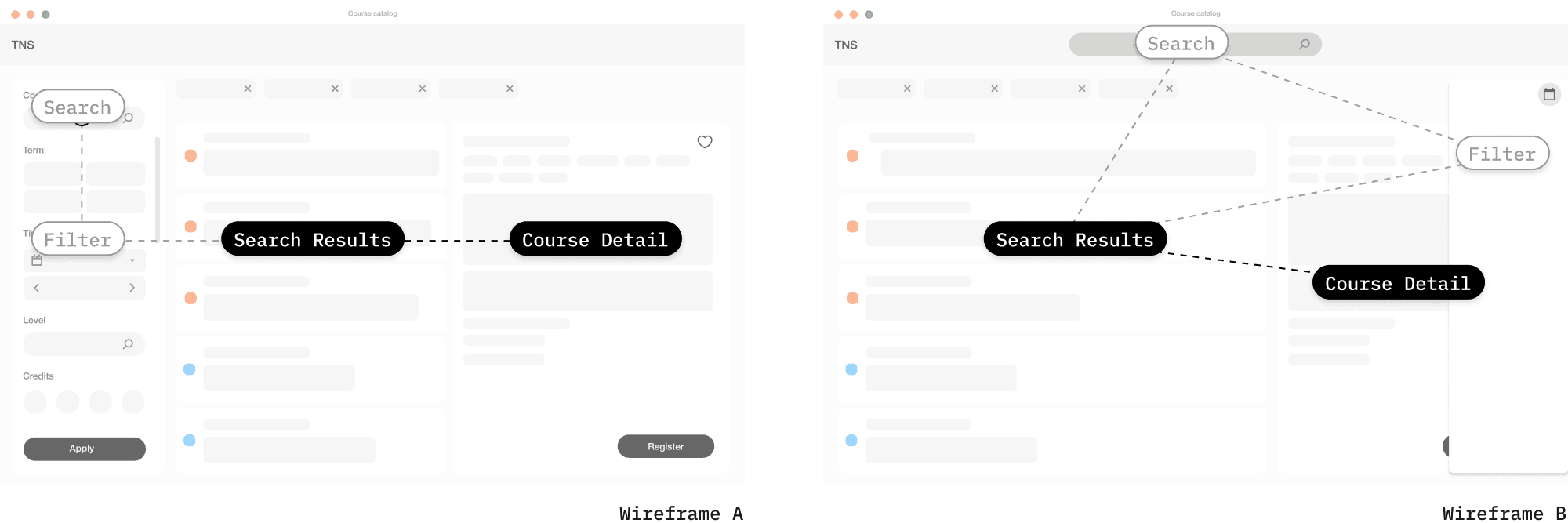
Use A/B Test To Decide The Flow of Information
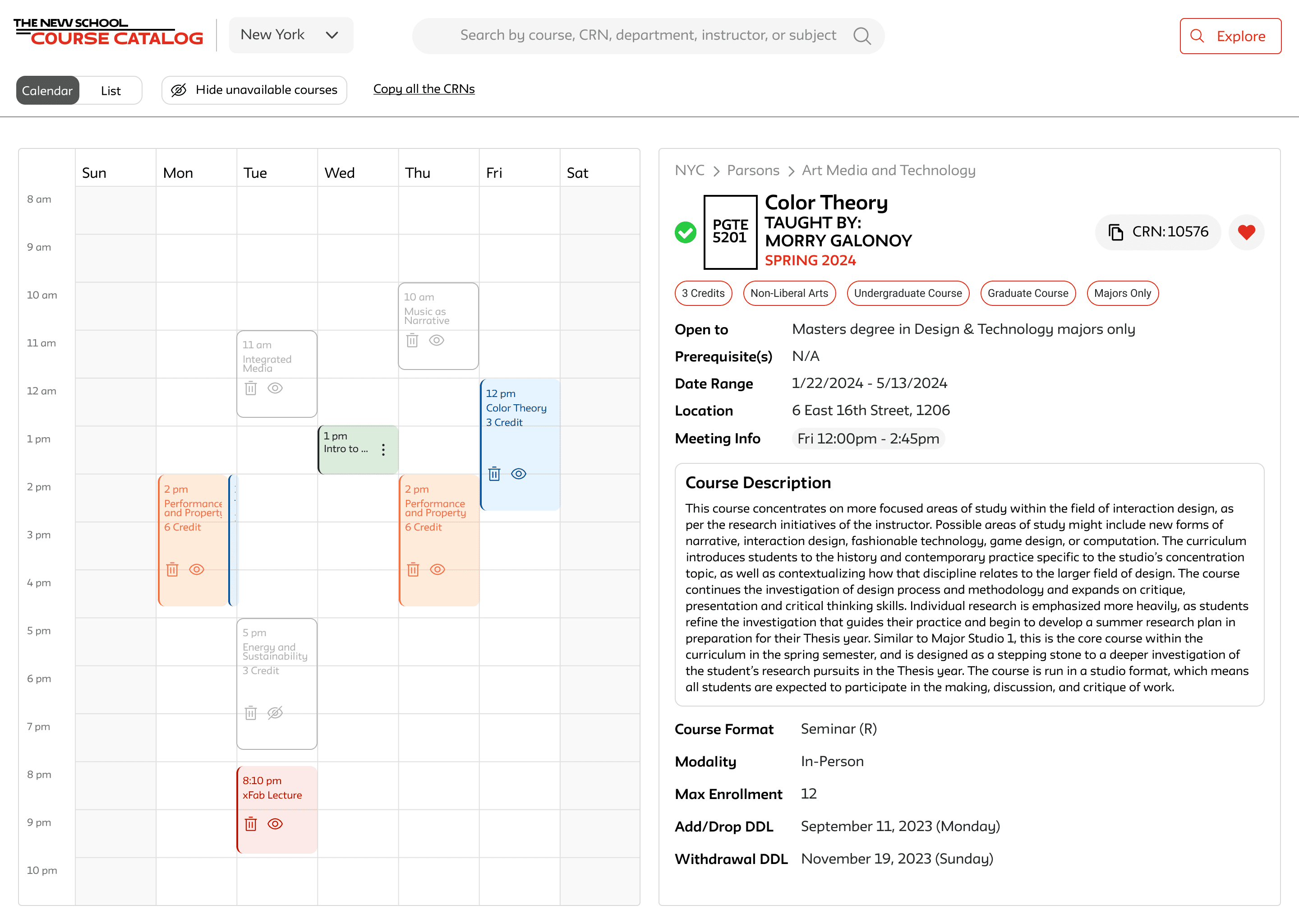
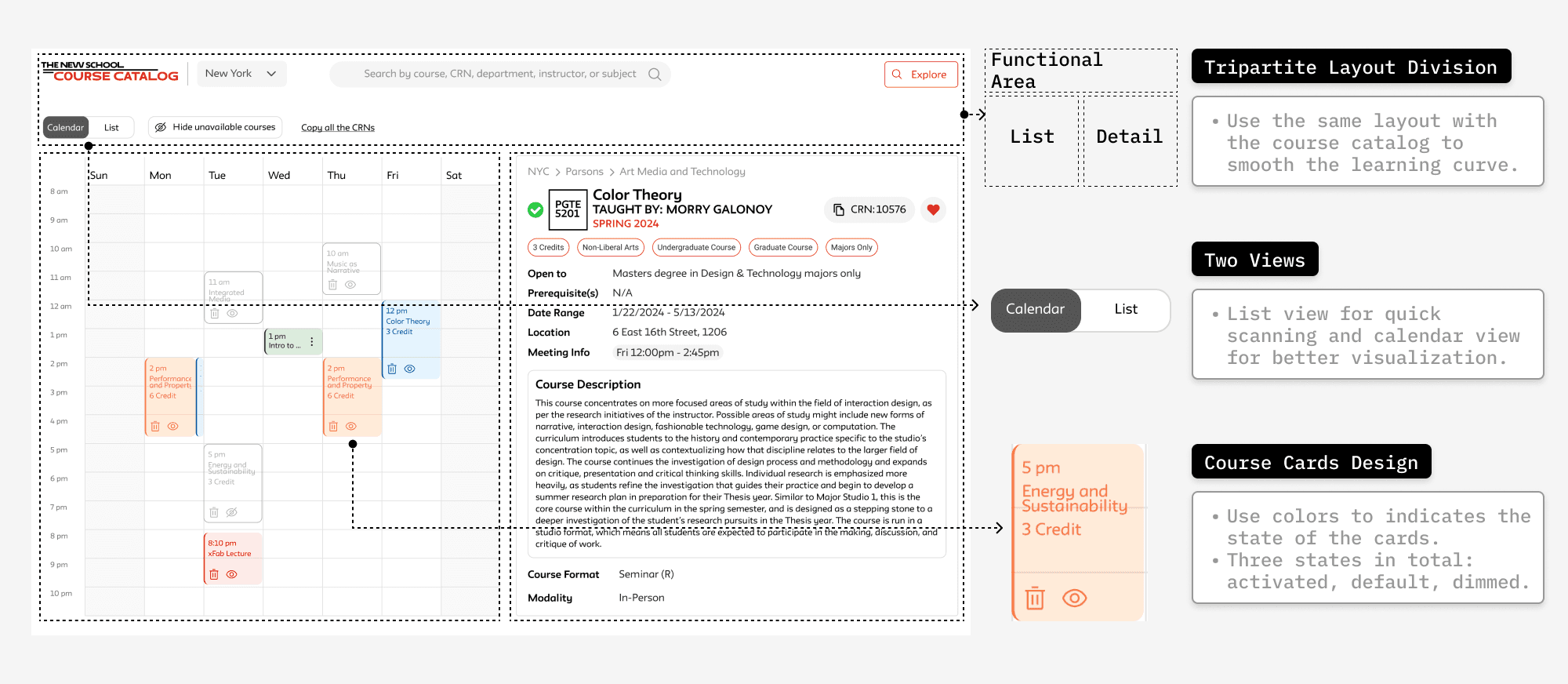
We made the decision to put search results and course details side by side based on the observation that students were constantly switching between those two pages.
However, we couldn’t decided on the layout of filter and search bar, so we made two versions and ran a quick user test.

A combination
Students found Mid-Fi A is more intuitive to use, but they also prefer the two column layout of Mid-Fi B as they are more simple.
So we decided to give combine the two layouts, making the filter panel foldable to save the screen space when not needed.
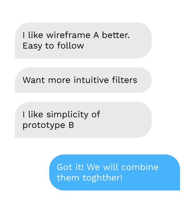
Task Analysis Feedback

Mid-Fi A
06.Design and iteration
b. Redesigned filter
Start from what we have
The old filter is over complicated and uneasy to use according to student interviews and task analysis.

Original filter
Bubble up what matters
We ran a survey to figure out which filter are more important to students.
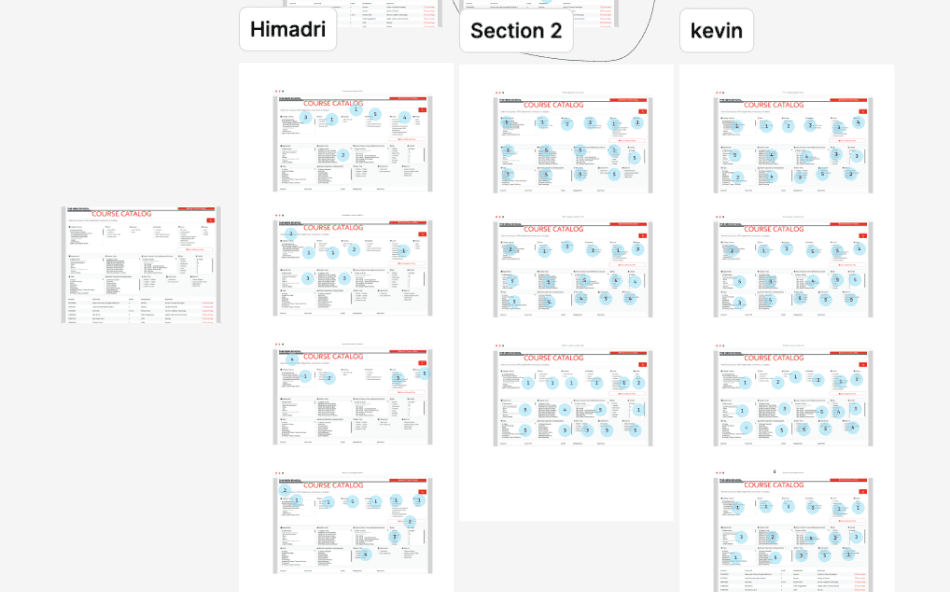
Survey on filter use frequency

Original filter information architecture
Divide and conquer
To make the filter system easier to use, we conceived a 3-pane filter system

Redesigned filter IA

Redesigned filter
06.Design and iteration
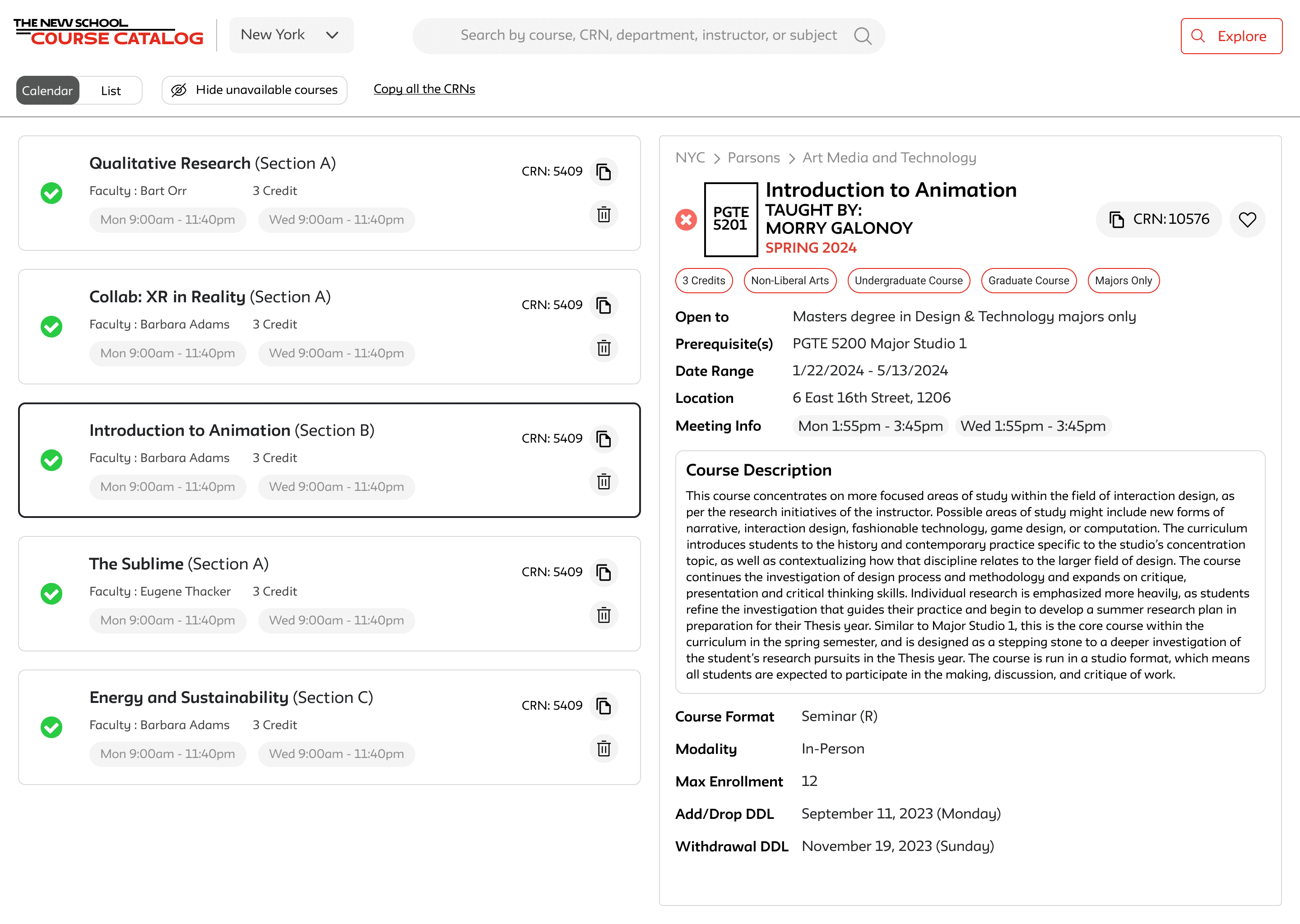
c. Course and Sections
A closer look of search results
A significant issue with the original search results page was the absence of clear course section information, compounded by the presence of multiple entry points to detailed course information, which complicated the navigation process with additional clicks.
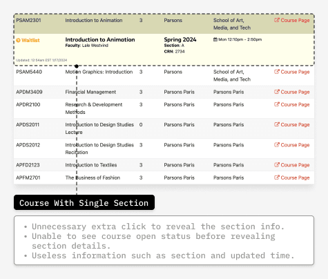
Courses With Single Section

Courses With Multiple Sections
Search result card redesign
There are many courses that has only one section, so we decided to remove the extra click by combining the title and details in one card.

Redesigned filter
06.Design and iteration
d Detailed Course info
Original course details
The original course detail page is hard to read in a lot of ways.
A lot of students had missed course level info because of the random layout. the non-scannable layout made it hard for them to get the information they needed.
important information was given insufficient visual priority, irrelevant technical information should not precede meeting time information.

Original Course detail page
Redesigned Course details
We redesigned the course detail page based on surveys and user interviews. Introduced Copy CRN and add to wishlist button, reorganized course information based on their importance.

Survey on filter frequency
06.Design and iteration
e.Wishlist Feature Enabled by Cookies
Identifying the Gap
Upon reviewing the existing user flow, it has been identified that there is a lack of a dedicated platform for students to engage in course selection and scheduling.

From Problems to
Opportunities
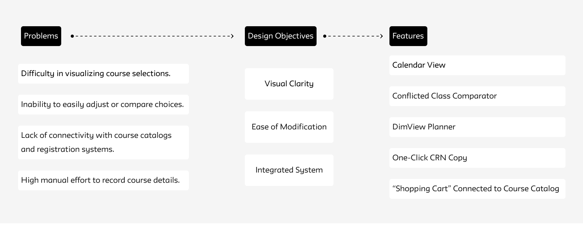
Upon a detailed examination of the current issues, we have identified unmet needs, which have informed the development of features for our new wishlist platform.
Bypassing Privacy Restriction With Cookies
No access to personal registration data as limited by FERPA law, except we get a certified license.
Save courses to a wishlist without login.
Wishlist persists across sessions for convenience.
06.Design and iteration
f.Closer Look to Wishlist Features
“Shopping Cart” Connected with Course Catalog
An all-in-one wishlist function linked to the course catalog, simplifying the process of comparing courses and organizing schedules for students.
Create a clearer visualization of the schedule
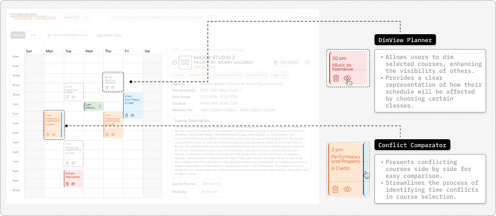
DimView Planner: Designed to assist students in visualizing their weekly schedule.
Conflict Comparator: Designed to facilitate comparison of courses with overlapping time slots, indicating potential schedule conflicts.
Copy CRN & “Checkout”
One-Click CRN Copy: Facilitates efficient course registration by allowing students to copy and paste CRNs directly into the registration system.
